

MLS Jersey Week is in the books as all 30 clubs have revealed their latest looks, designs and bold (maybe too bold in some cases) choices that will definitely spark some debate.
In this week’s MLS Roundup, we’re going to look at every kit that was released this week (aside from FC Dallas, you can view our thoughts on it below). I have a couple of tiers, or categories if you will, on how I felt about each kit. Some are truly great, while others fall into a ‘what the’ kind of category for me.
Let’s dive into the kits!
The best of the best
There were four that stood out to me the most. They fell into the boat of “I would buy them if I supported these teams” kind of category.
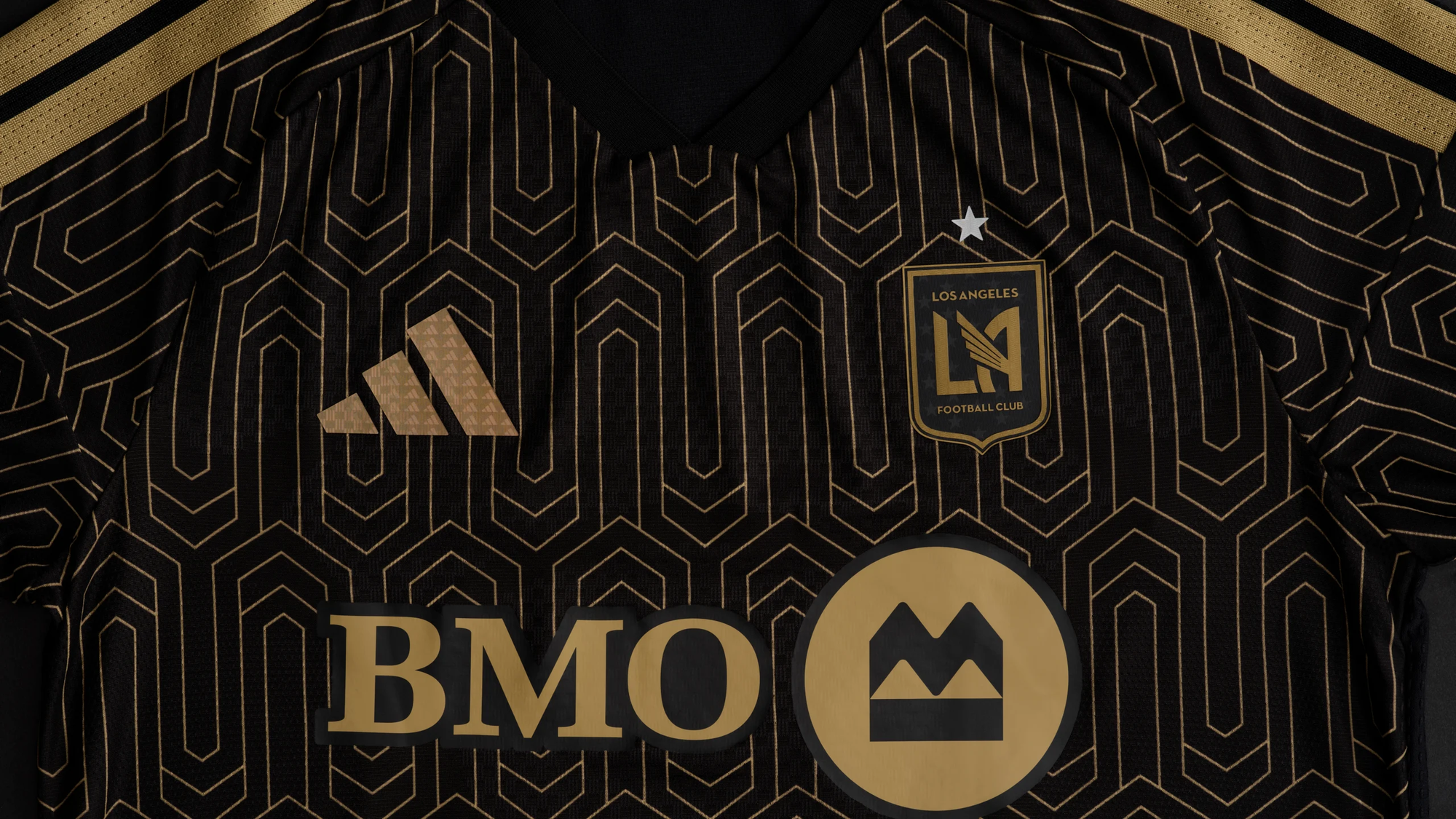
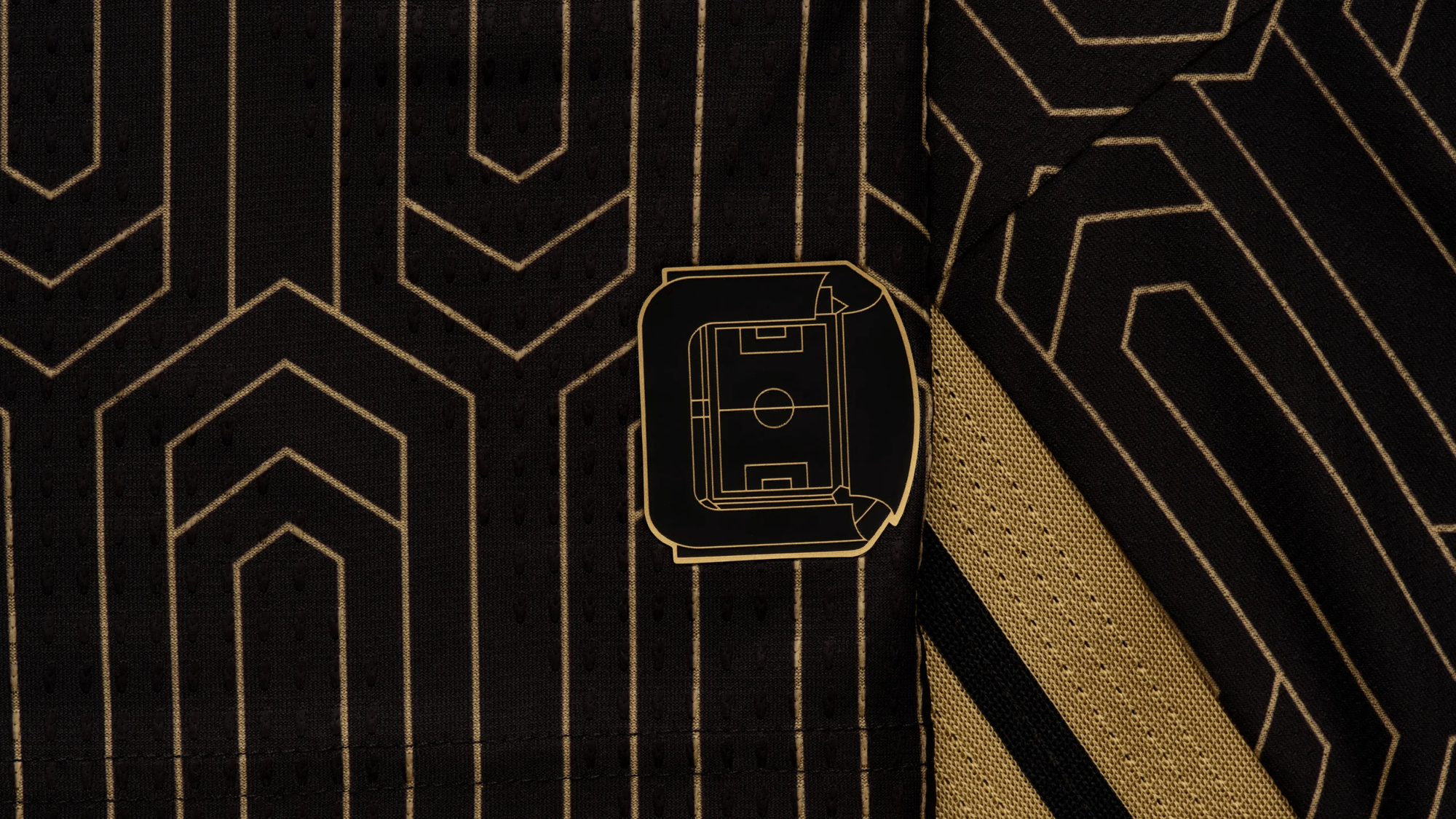
LAFC
I don't think it should be any surprise to see LAFC come out with one of the better kits again this year. The details on this one stand out so well.
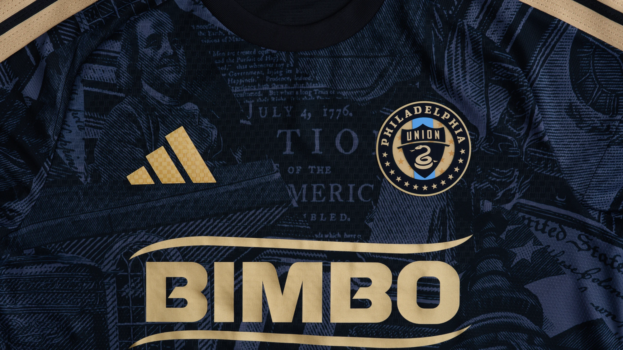
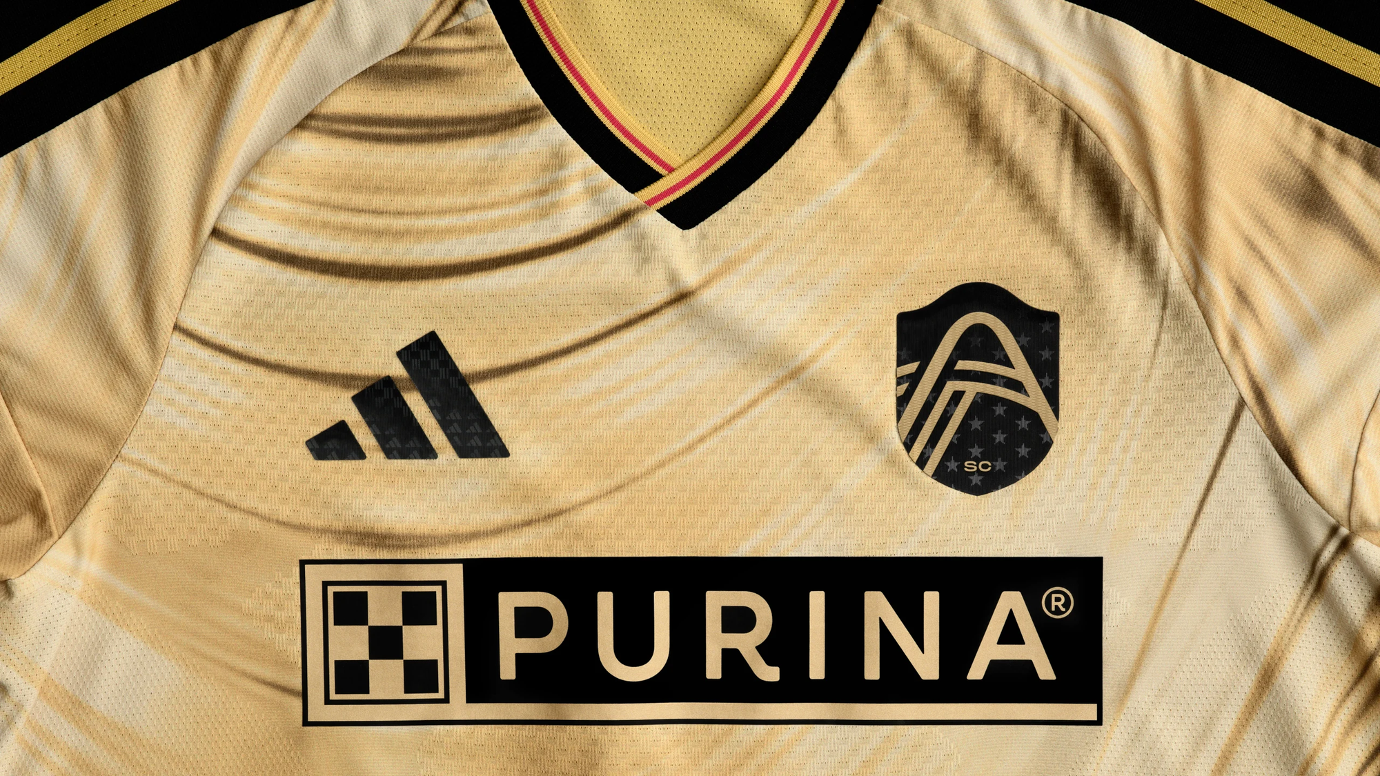
Philadelphia Union
I think if I were to spend money on a kit this year that wasn't FC Dallas-related, it may actually be this one. It is almost a "no notes" kind of kit for me.
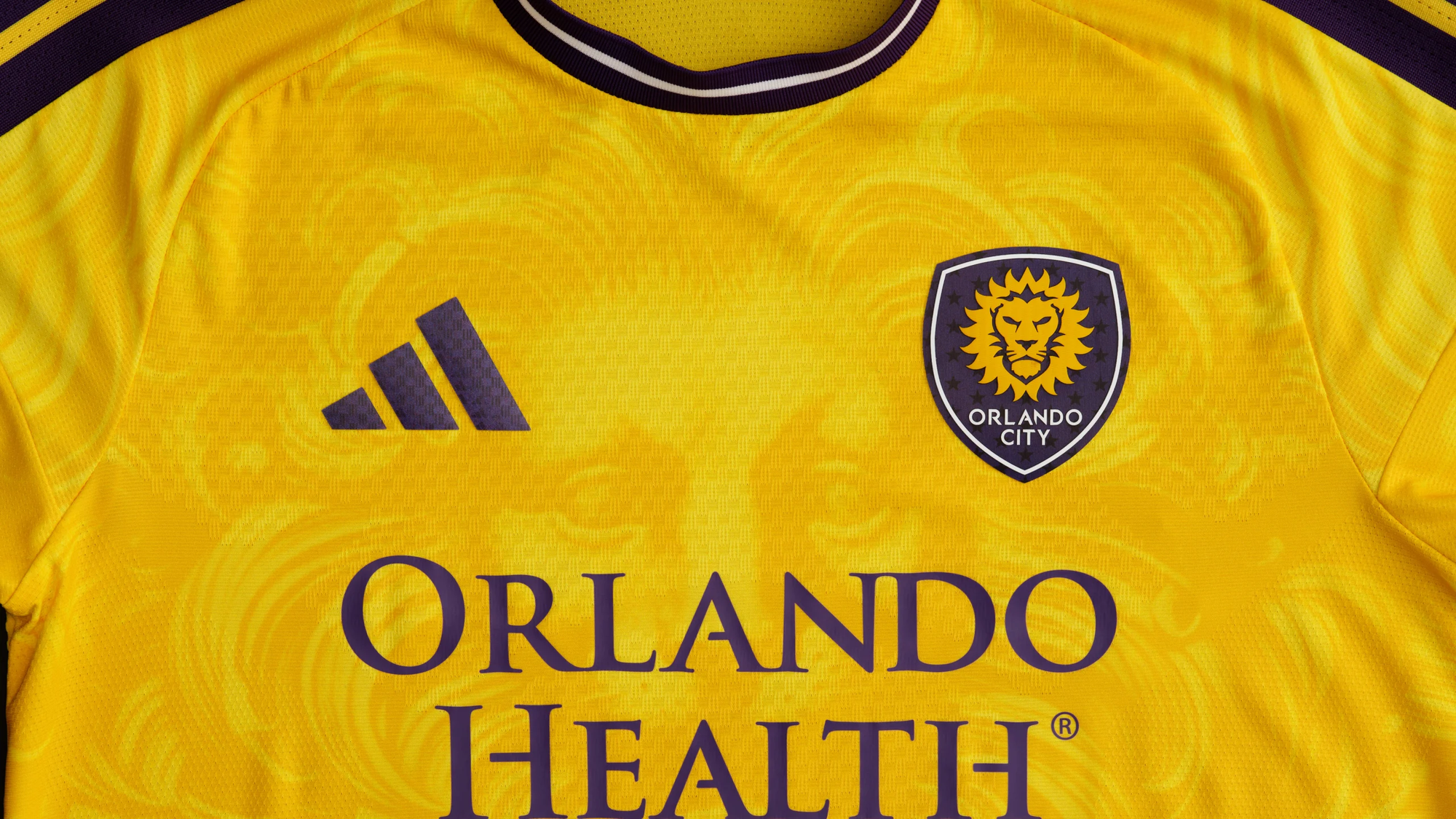
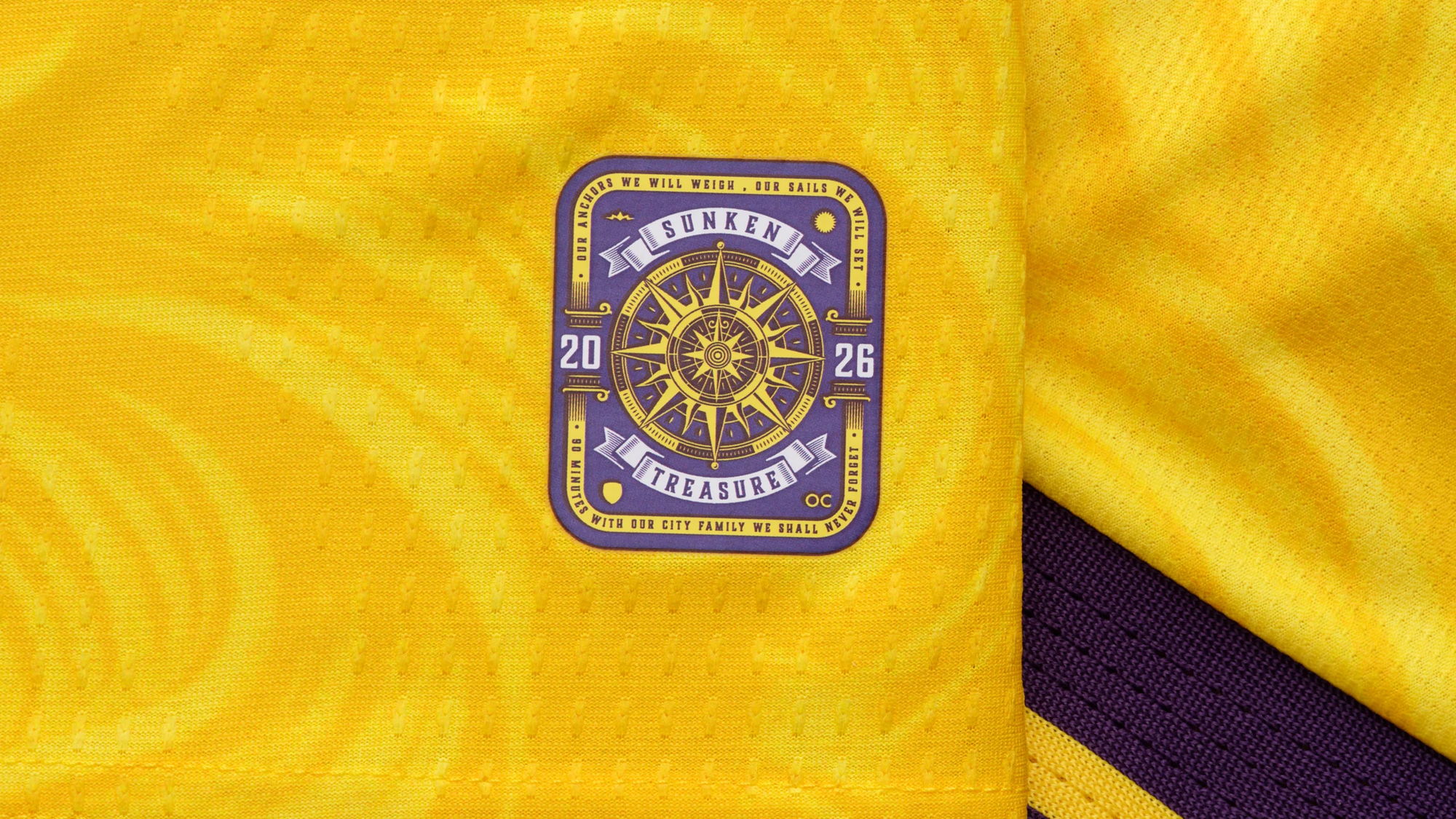
Orlando City
Yellow and purple together, the way they should be.
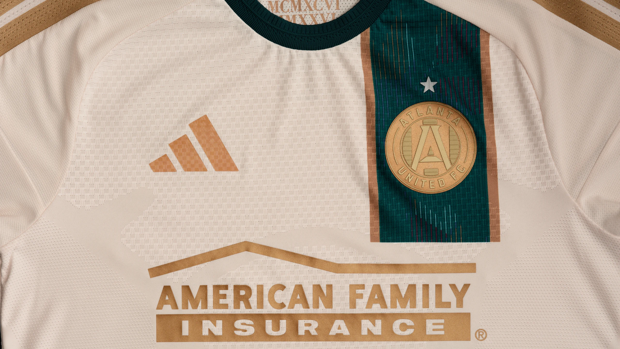
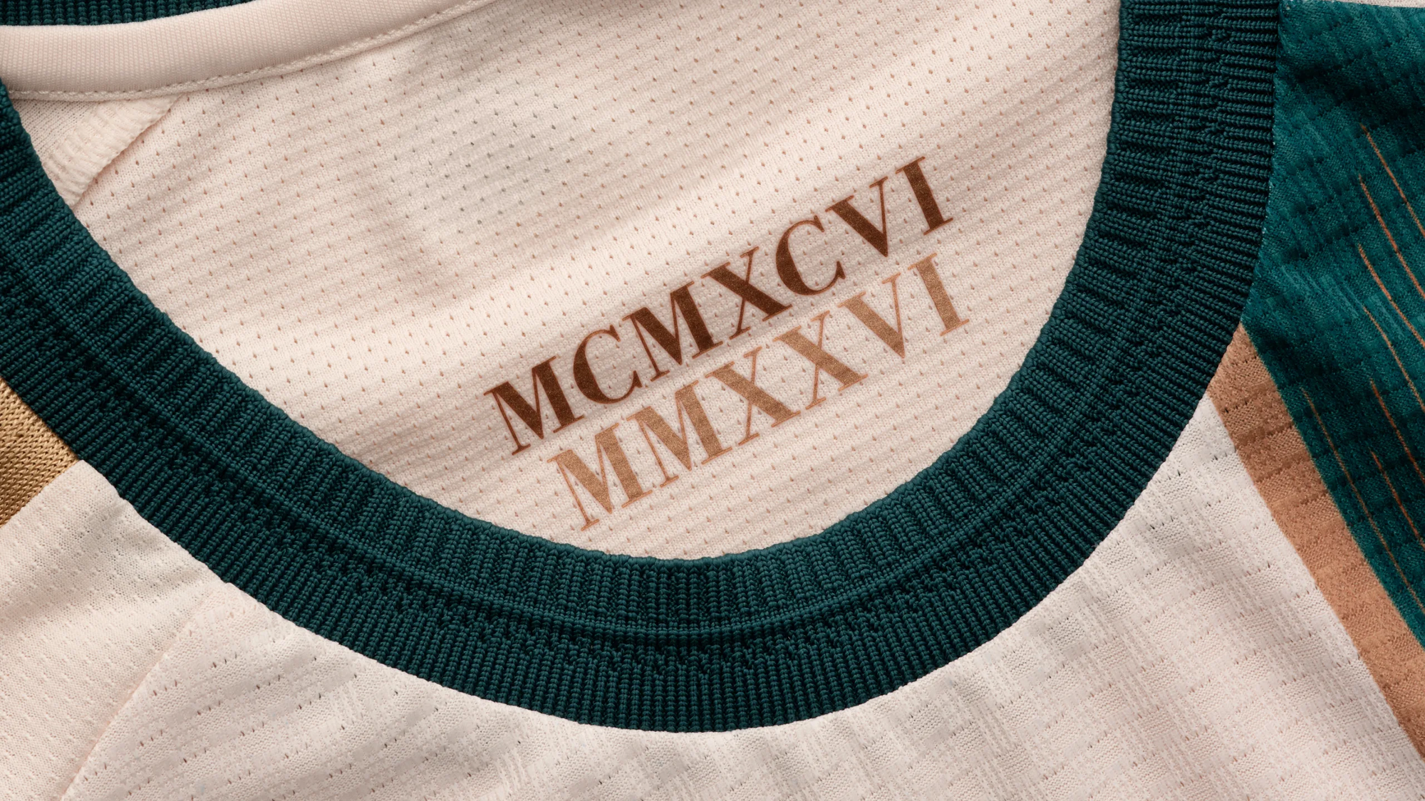
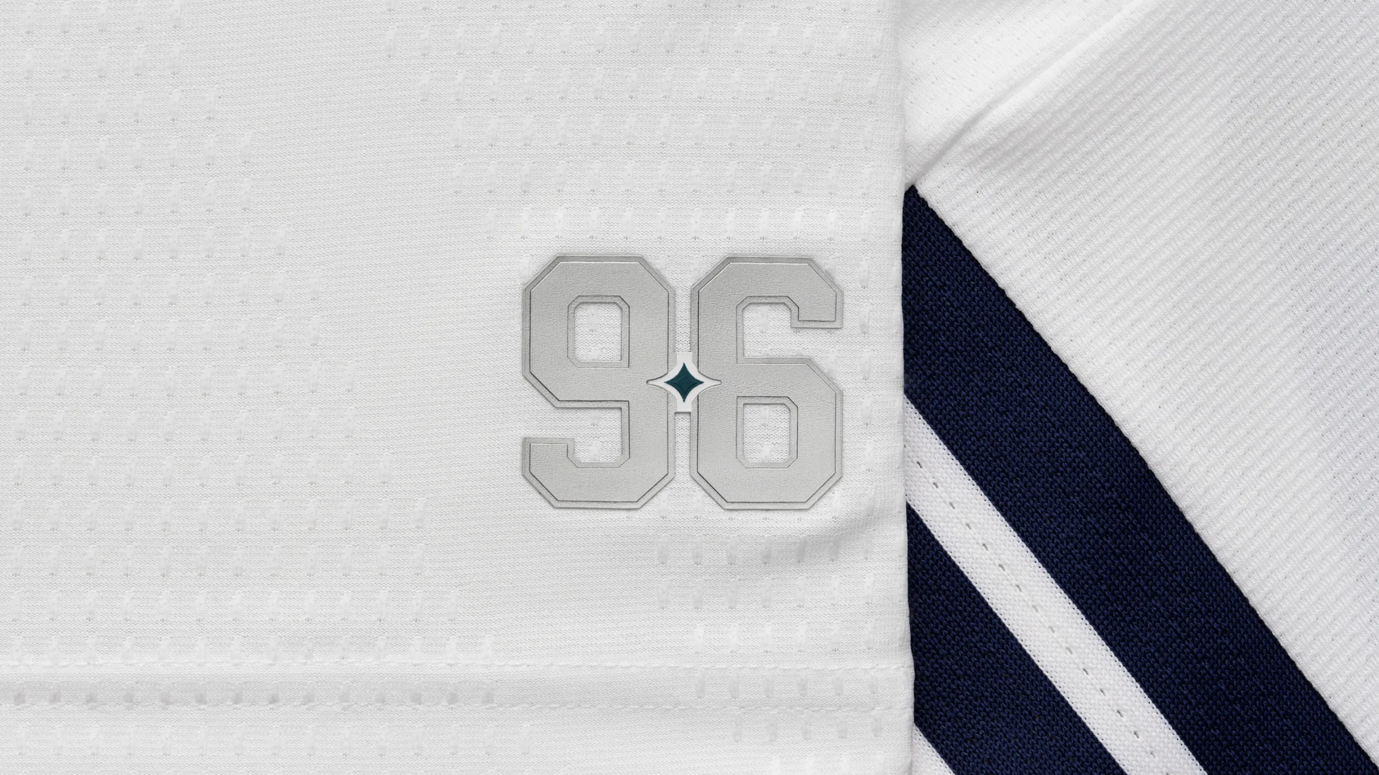
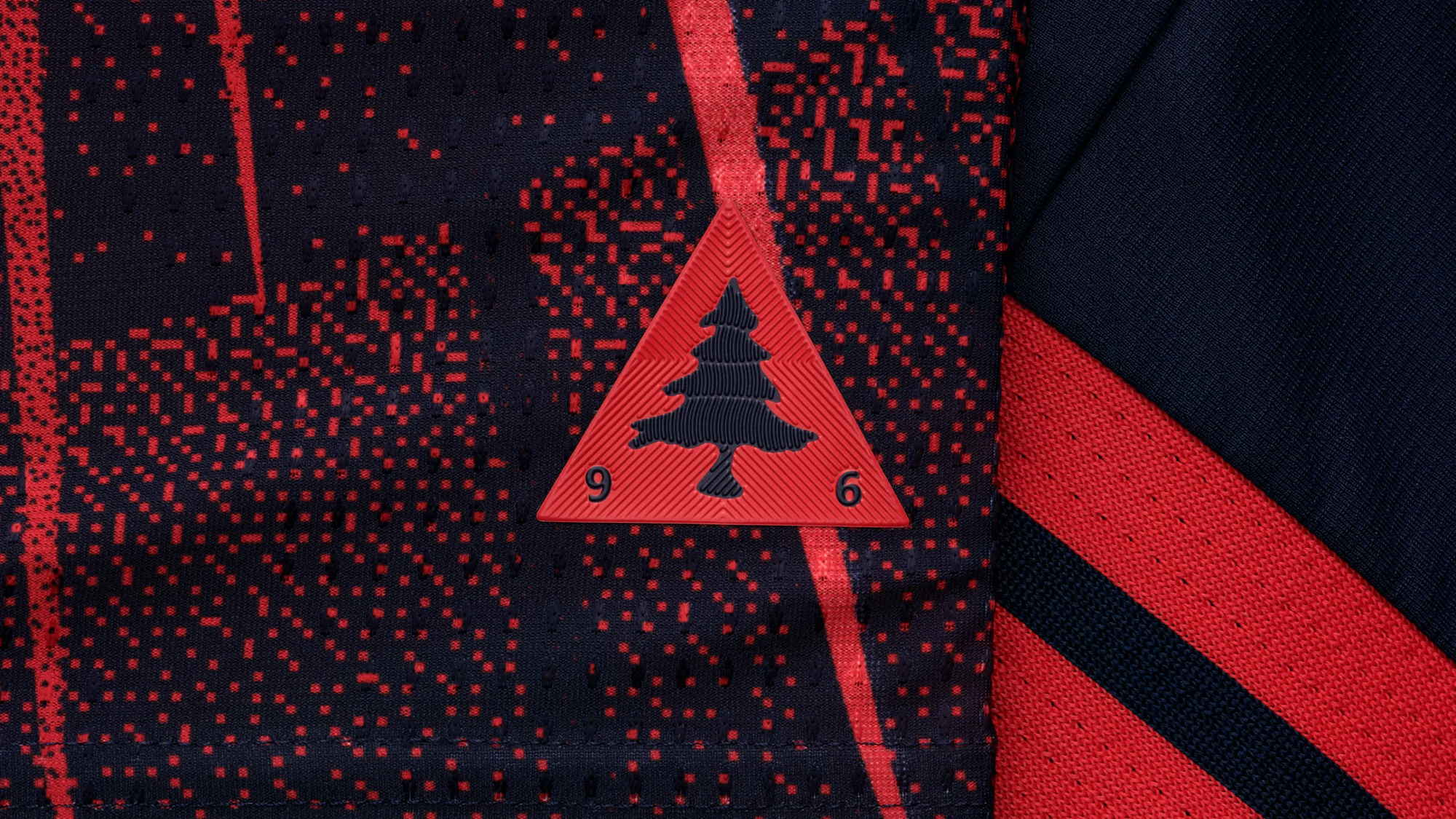
Atlanta United
Paying respect to the 1996 Summer Olympics, this kit may actually be my favorite of the bunch this year.
The free stuff tells you what happened. A paid subscription tells you why it happened, what it means for FC Dallas, and what’s coming next—before anyone else catches up.
Sticking with what works
Some of the new kits felt like small improvements on some older models. They're good, but not great. In most cases I would consider purchasing if I were a fan of these clubs.
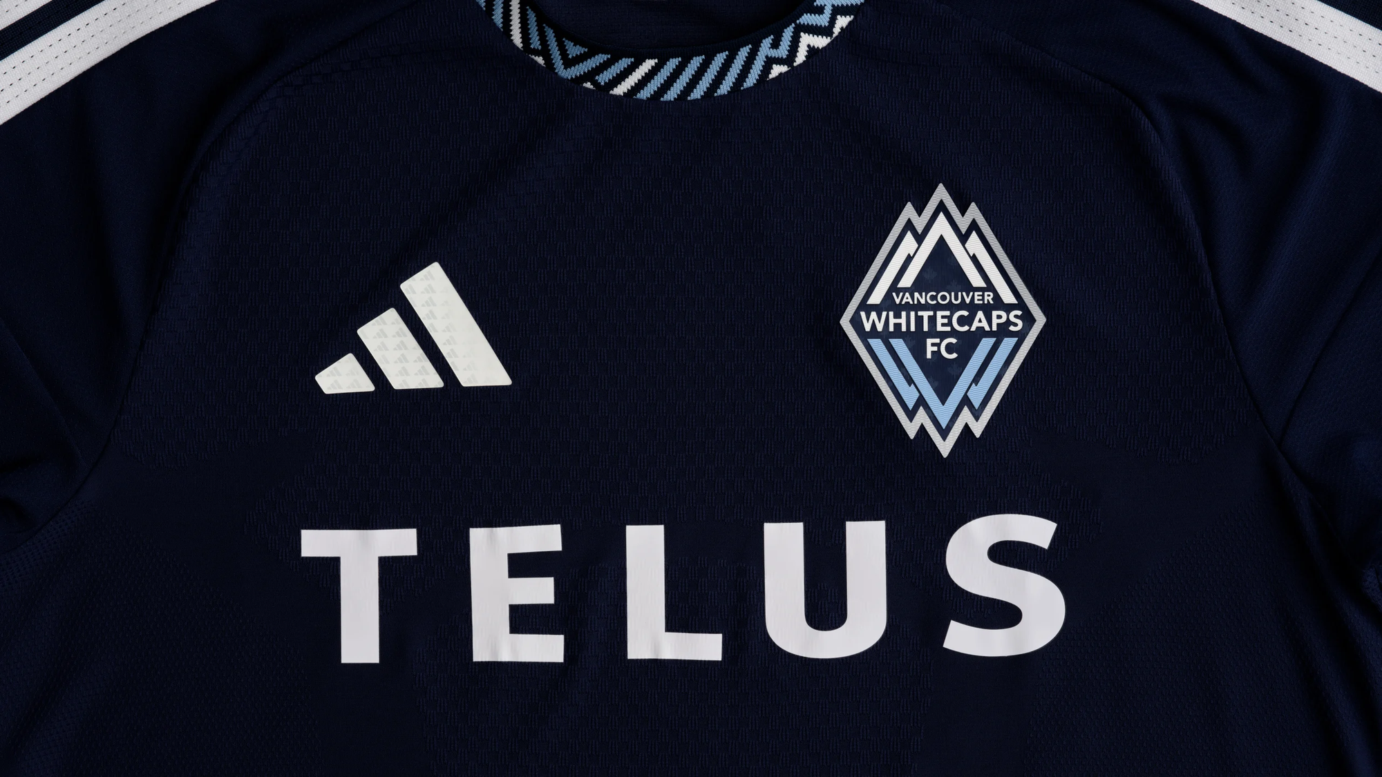
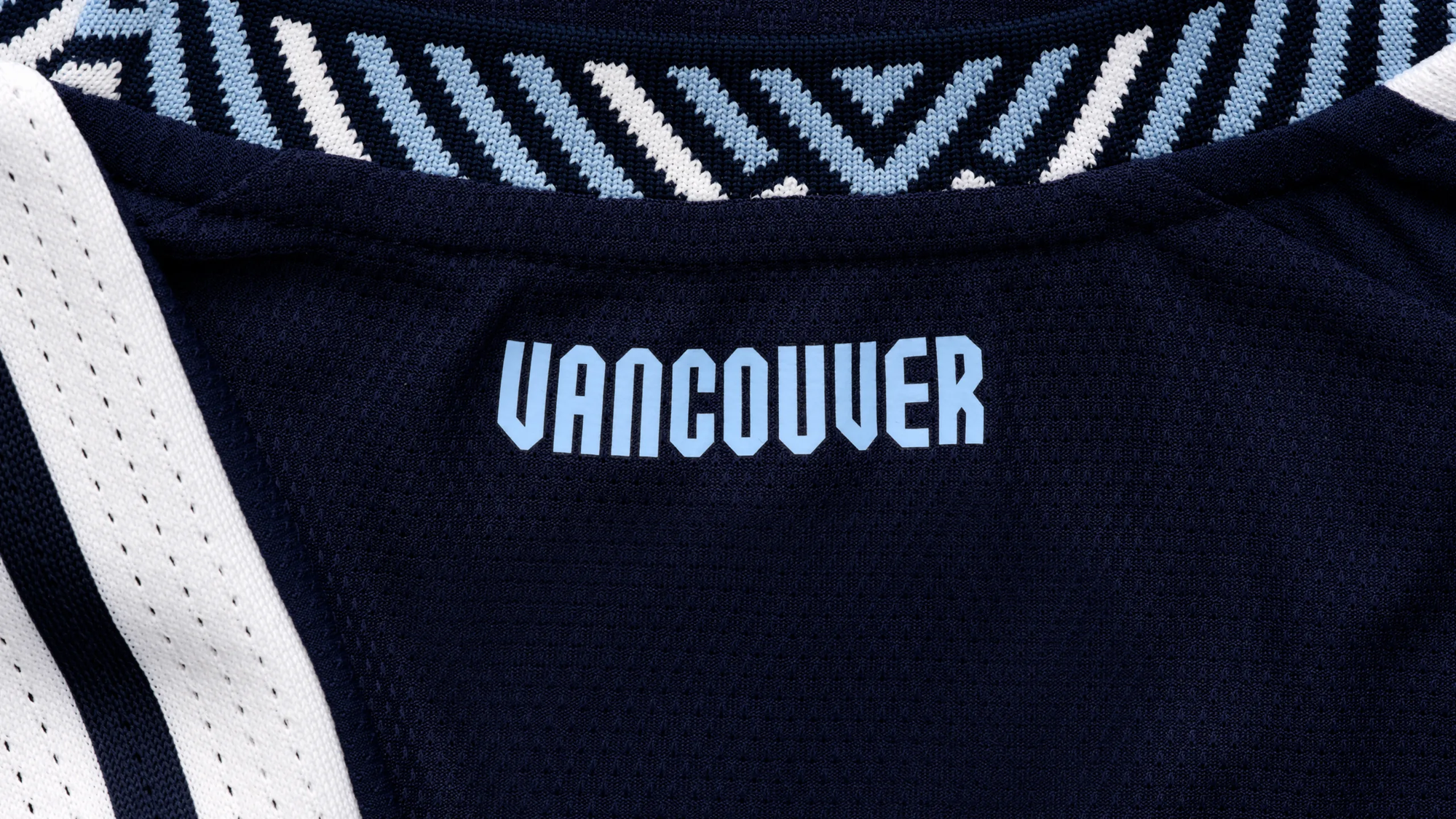
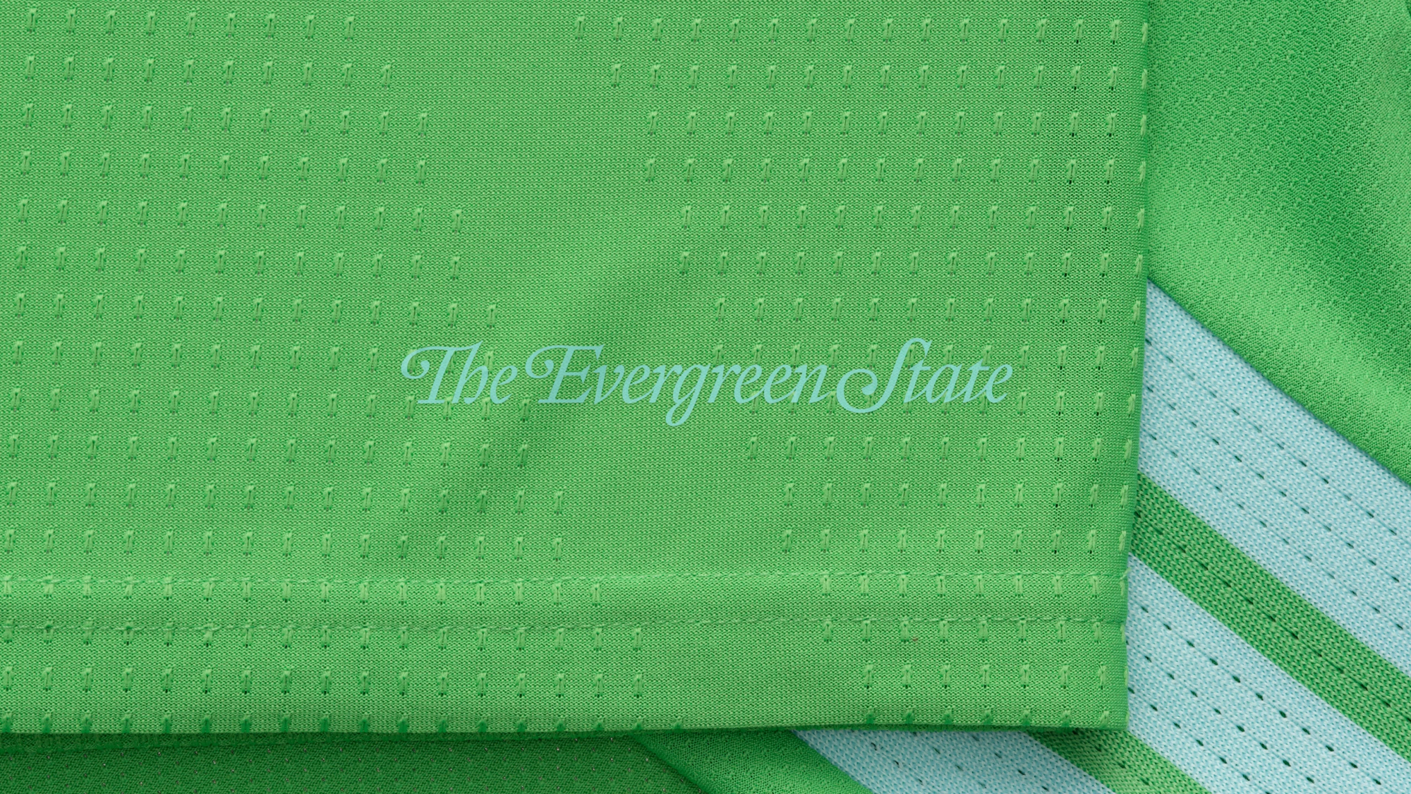
Vancouver Whitecaps
I nearly had it in my top group, as I still love the colors and simplicity of Vancouver's kits these days.
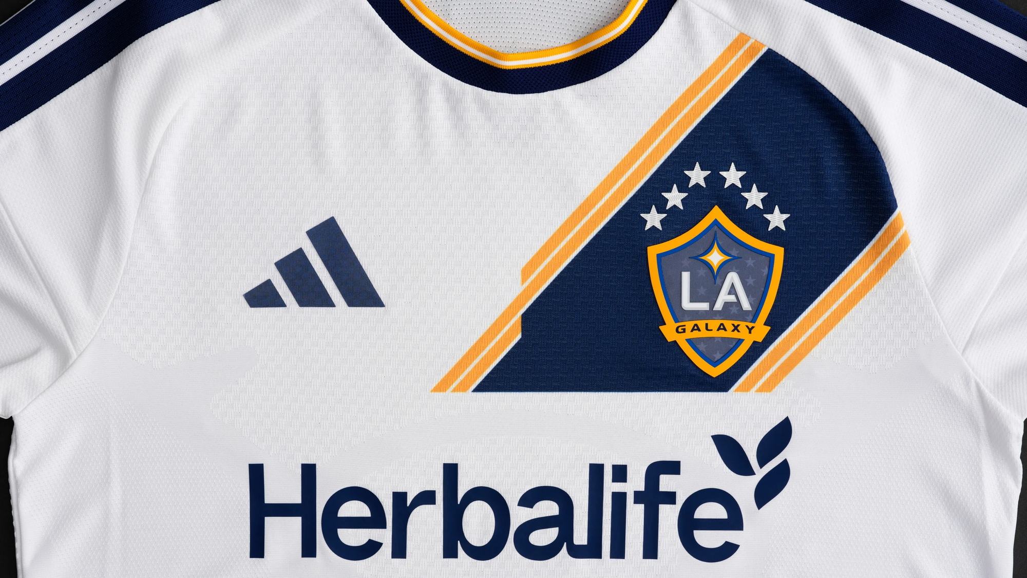
LA Galaxy
It is a nod to the sash kits of old for the Galaxy this year. I have a feeling these kits will be much better looking in person than the digital files suggest.
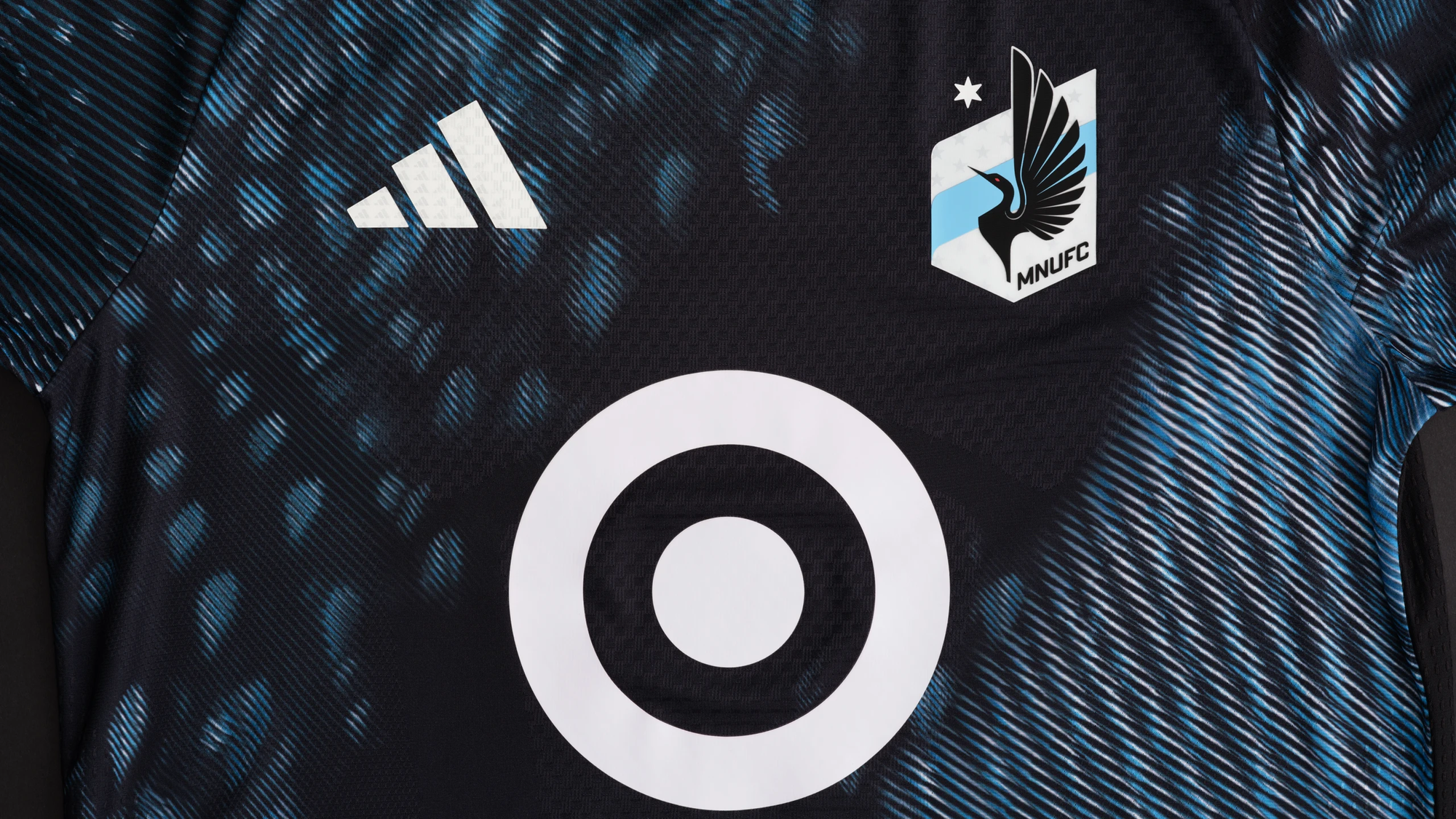
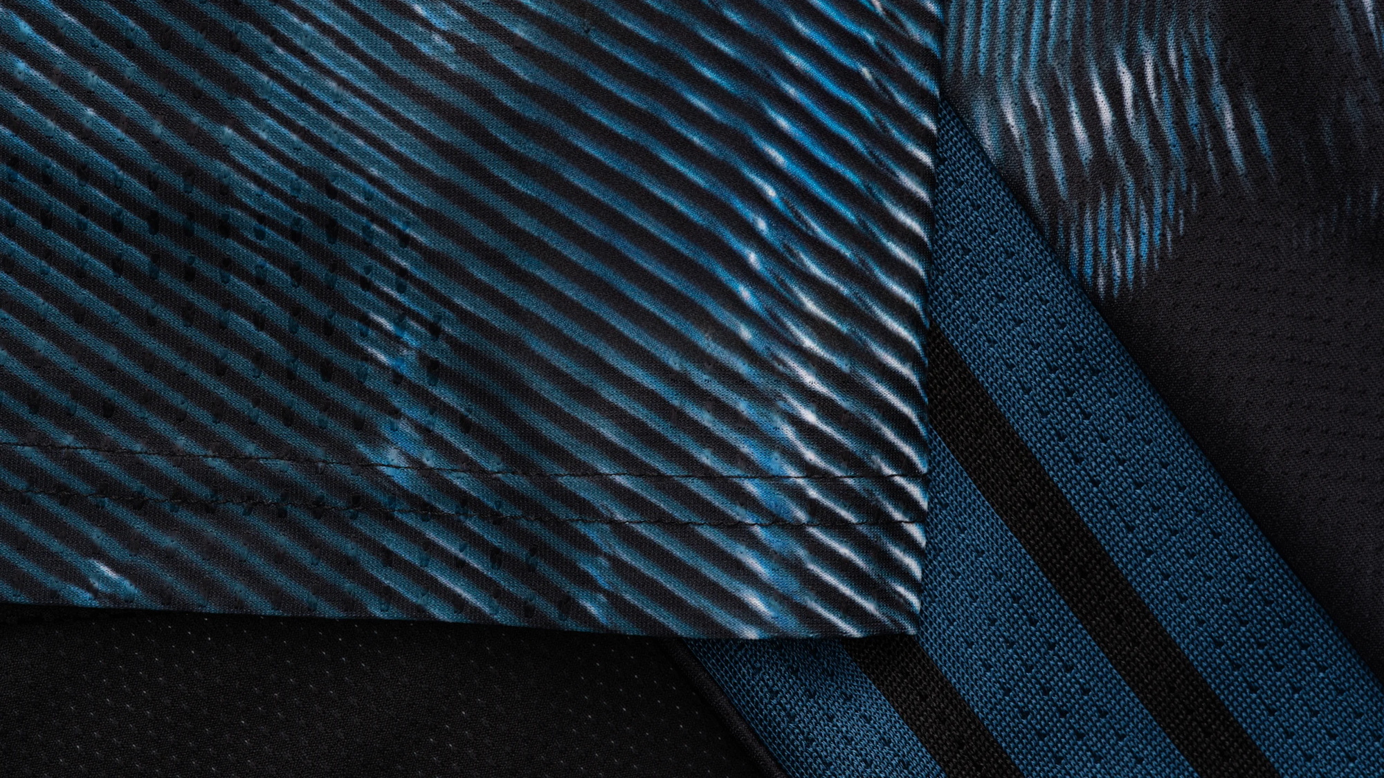
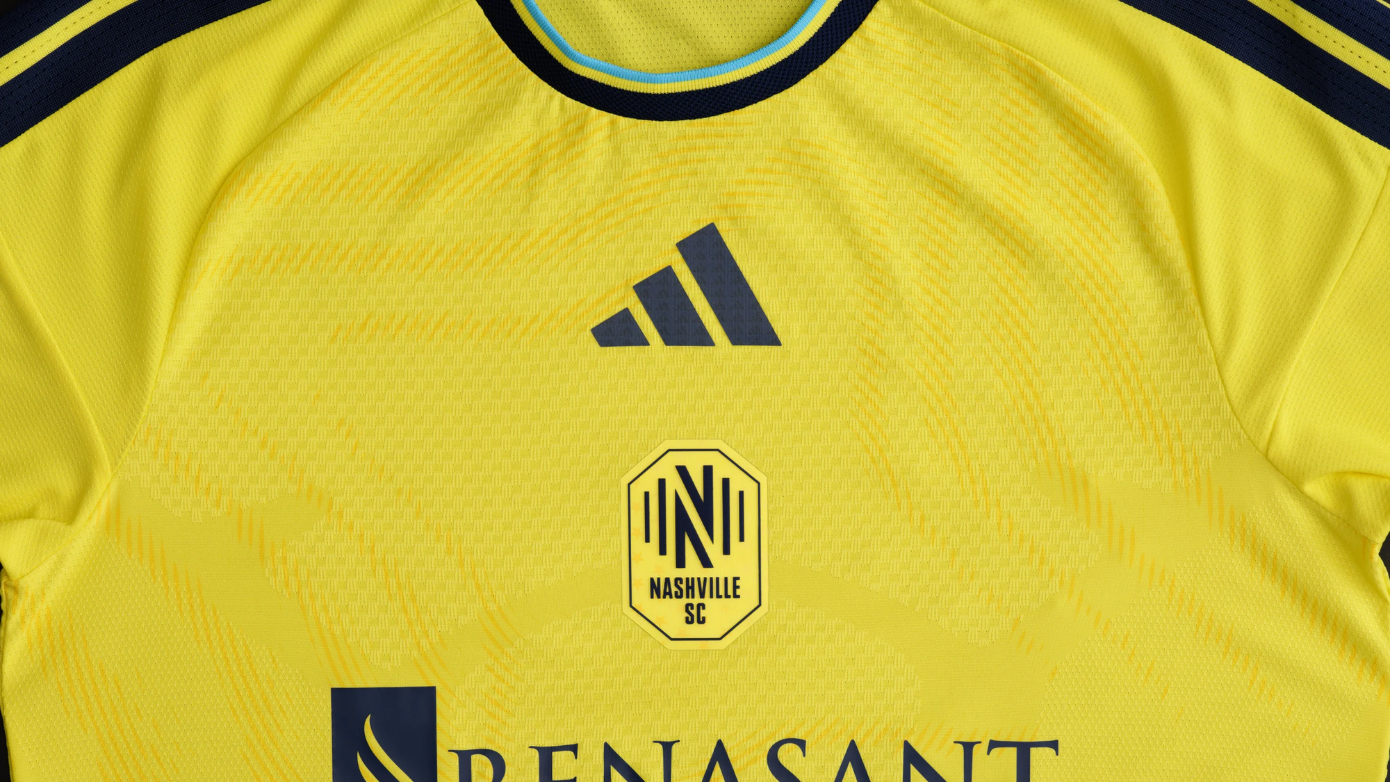
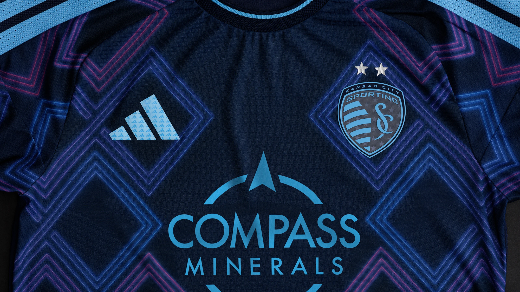
Minnesota United
On first glance, I wasn't a fan of these. Then I gave it a day and came back and my thoughts changed on it. It isn't going to be my favorite of the bunch this year, but I do appreciate where Minnesota is going with their kits these days.
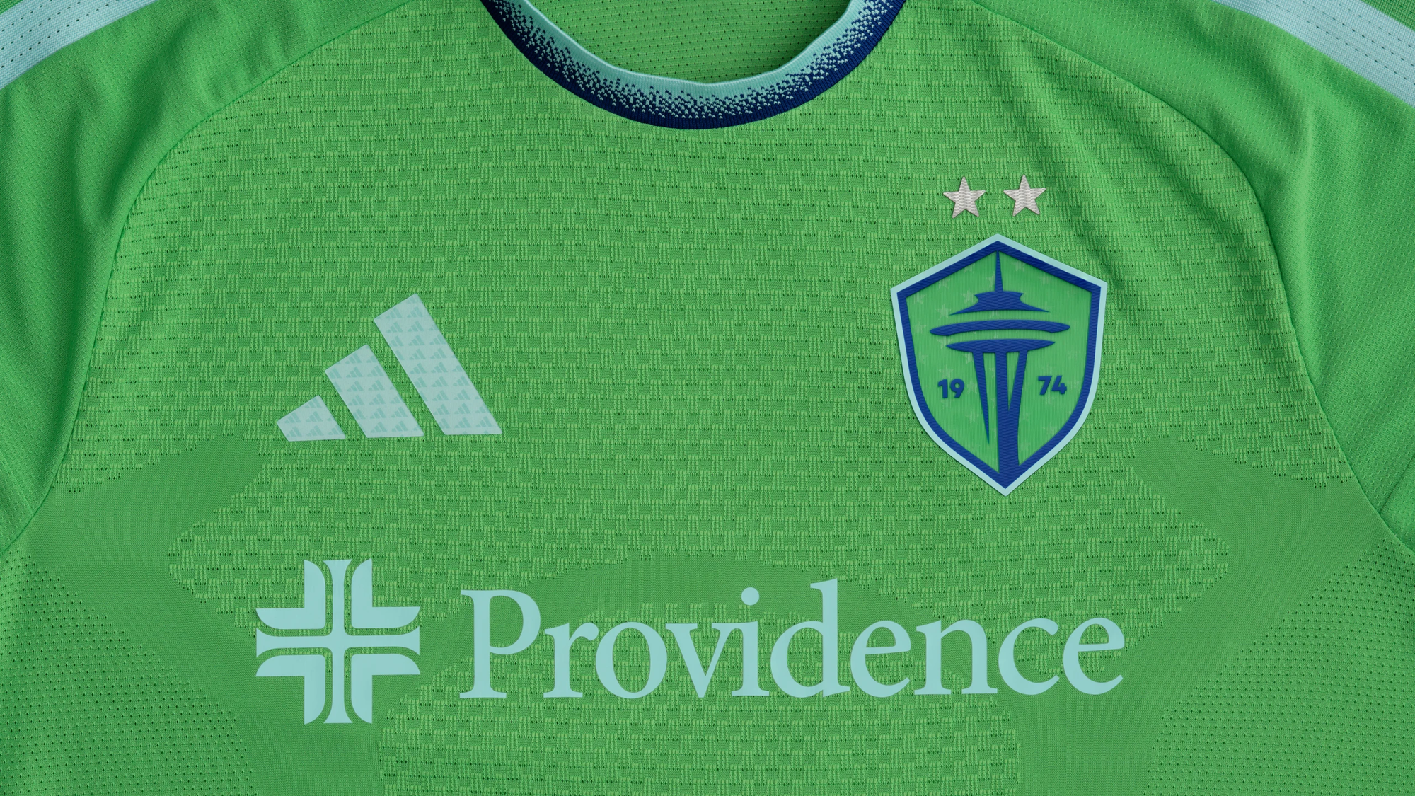
Seattle Sounders
It is clean, simple, and very on brand for Seattle.
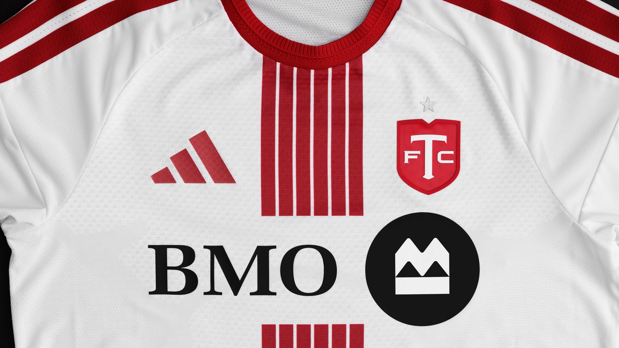
Toronto FC
Some of Toronto's white kits in the past have been bland, but this one is a step in the right direction.
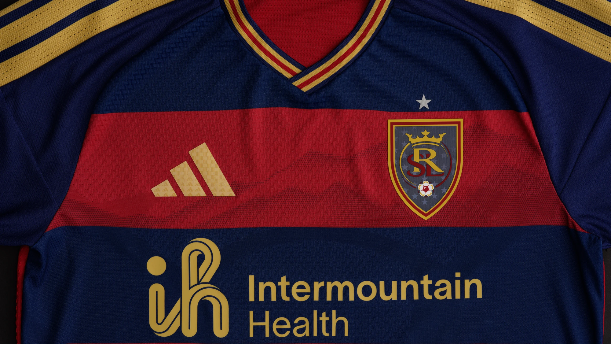
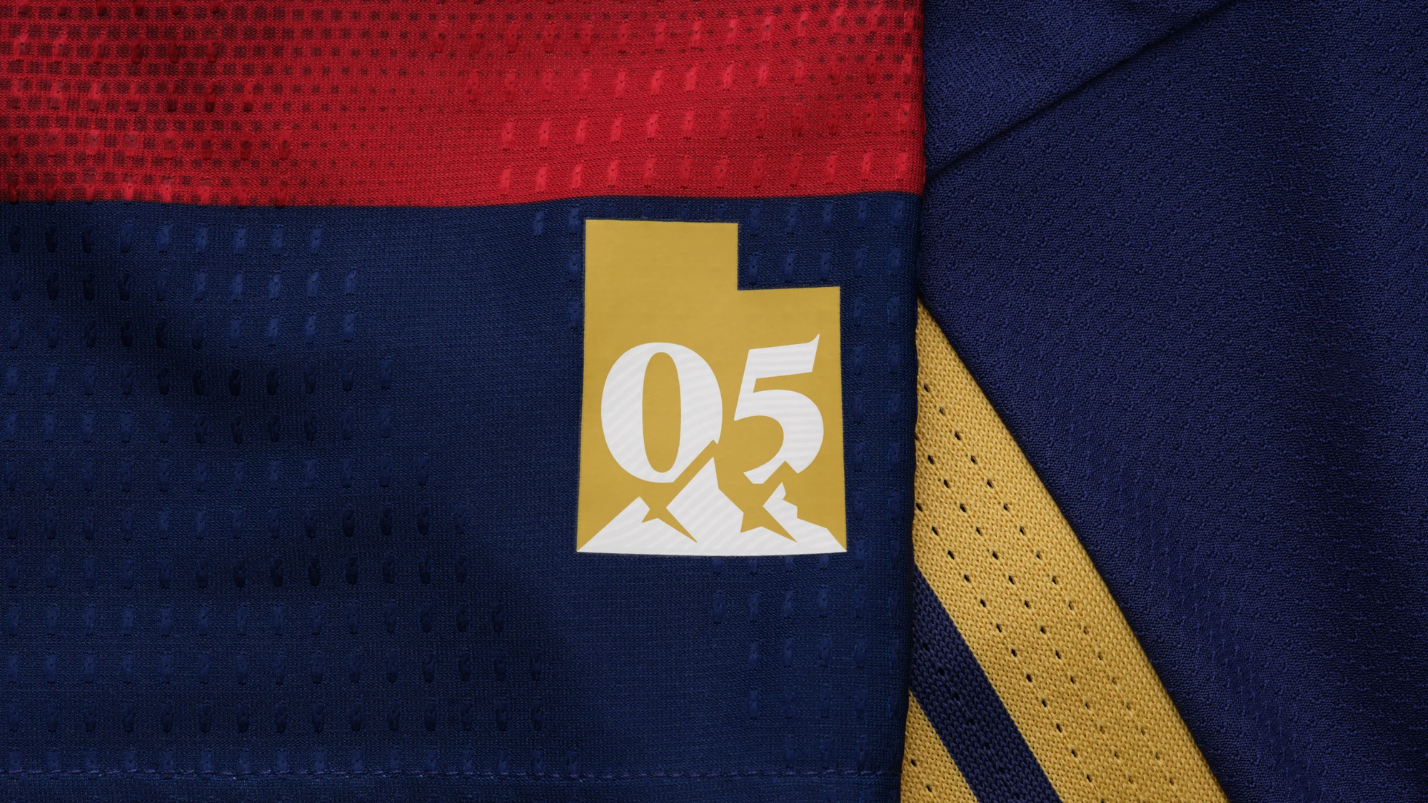
Real Salt Lake
Cue the Spiderman pointing gif when FC Dallas and RSL square off in their new kits this season. (which I highly doubt we'll see that...and that is lame)
So many that are just...fine
Okay, there are honestly several clubs that fall into the truly 'mid' category for me this year. They're all fine for the most part, but not anything that stands out as special to me. If I were a fan of one of these clubs and needed a fresh kit, I’m not sure I would spend the cash on these.
Yeah, they went for it...
Then there was a slew of kits that were...how do I put this nicely? Bold. Yeah, I think bold is probably the best way to describe the next set of kits. They’re not all that bad, but they’re also maybe a bit too out there for my taste.
Portland
I give Portland credit for this; they go for it whether it is a true knock-out of the park, like last year's green primary kits or some of their previous third kits, or, on the opposite end, their Rose-colored kits from a year or so ago. And now...this one.
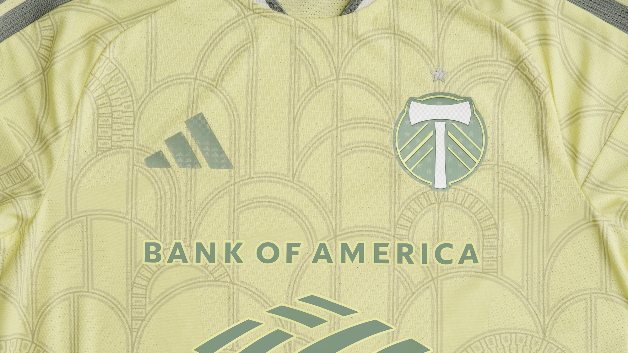
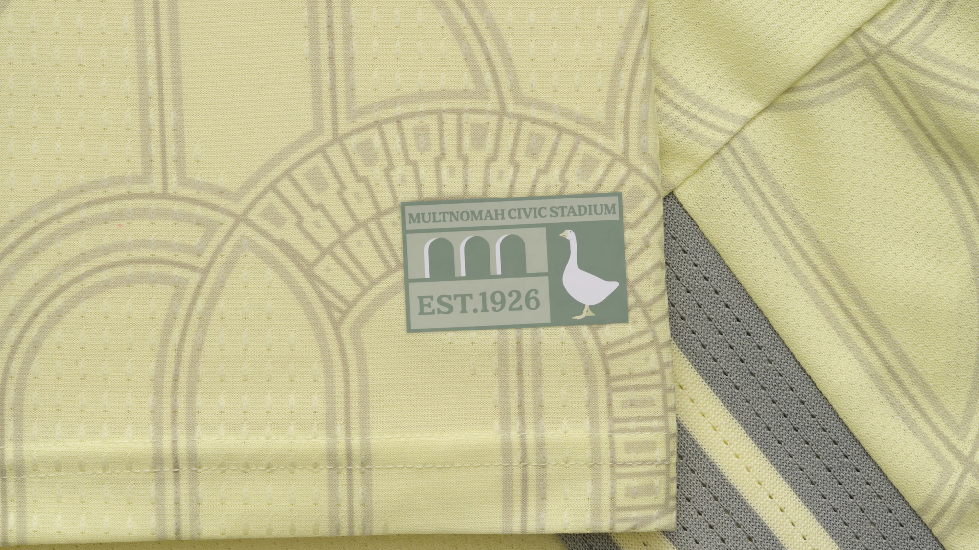
I get that it is paying respect to their stadium and its legacy in the Portland area. Maybe, just maybe, it will be better in person than online. But either way, its a big swing and a miss for me.
San Jose
The Dead Kit is truly something else.
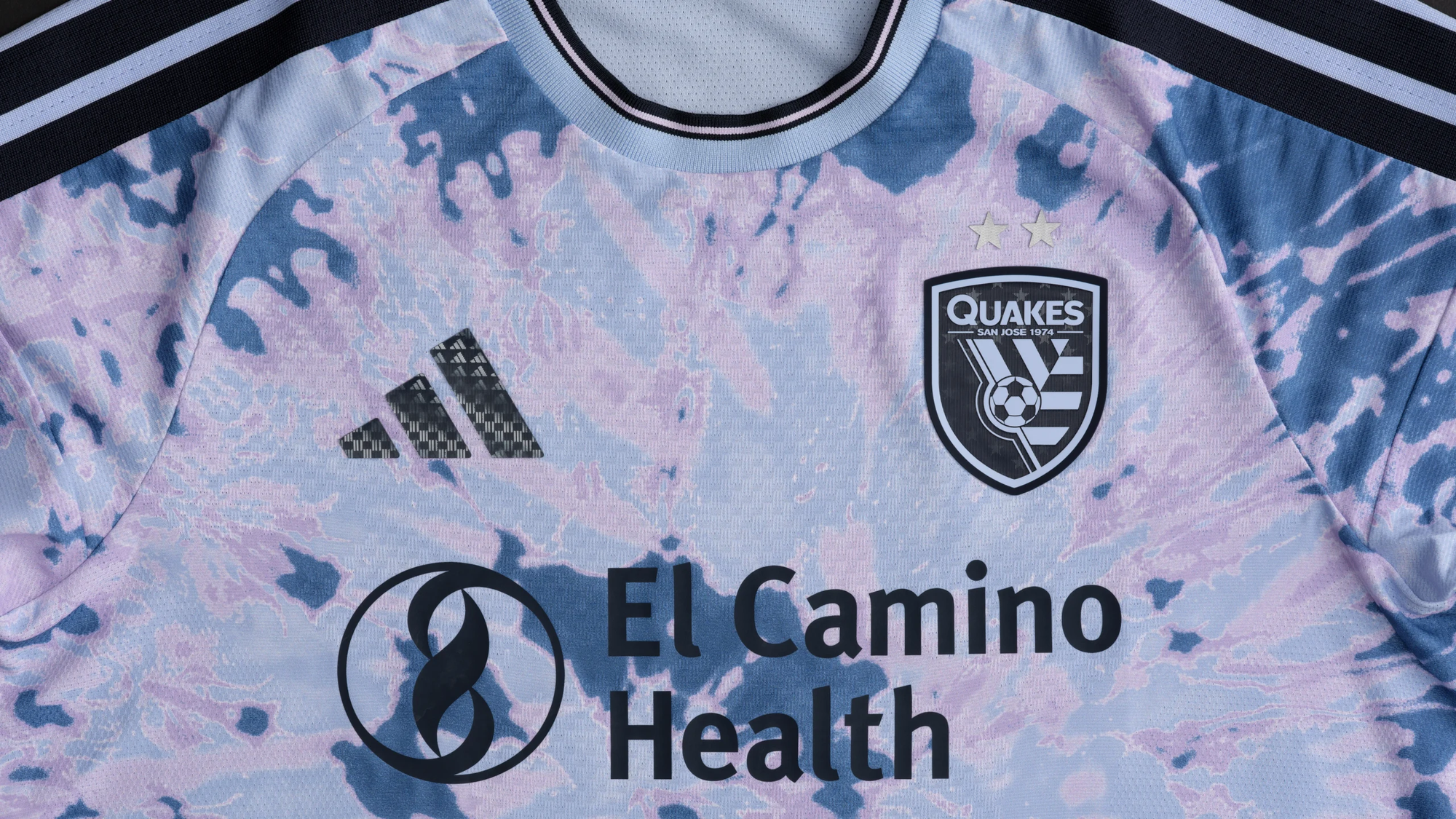
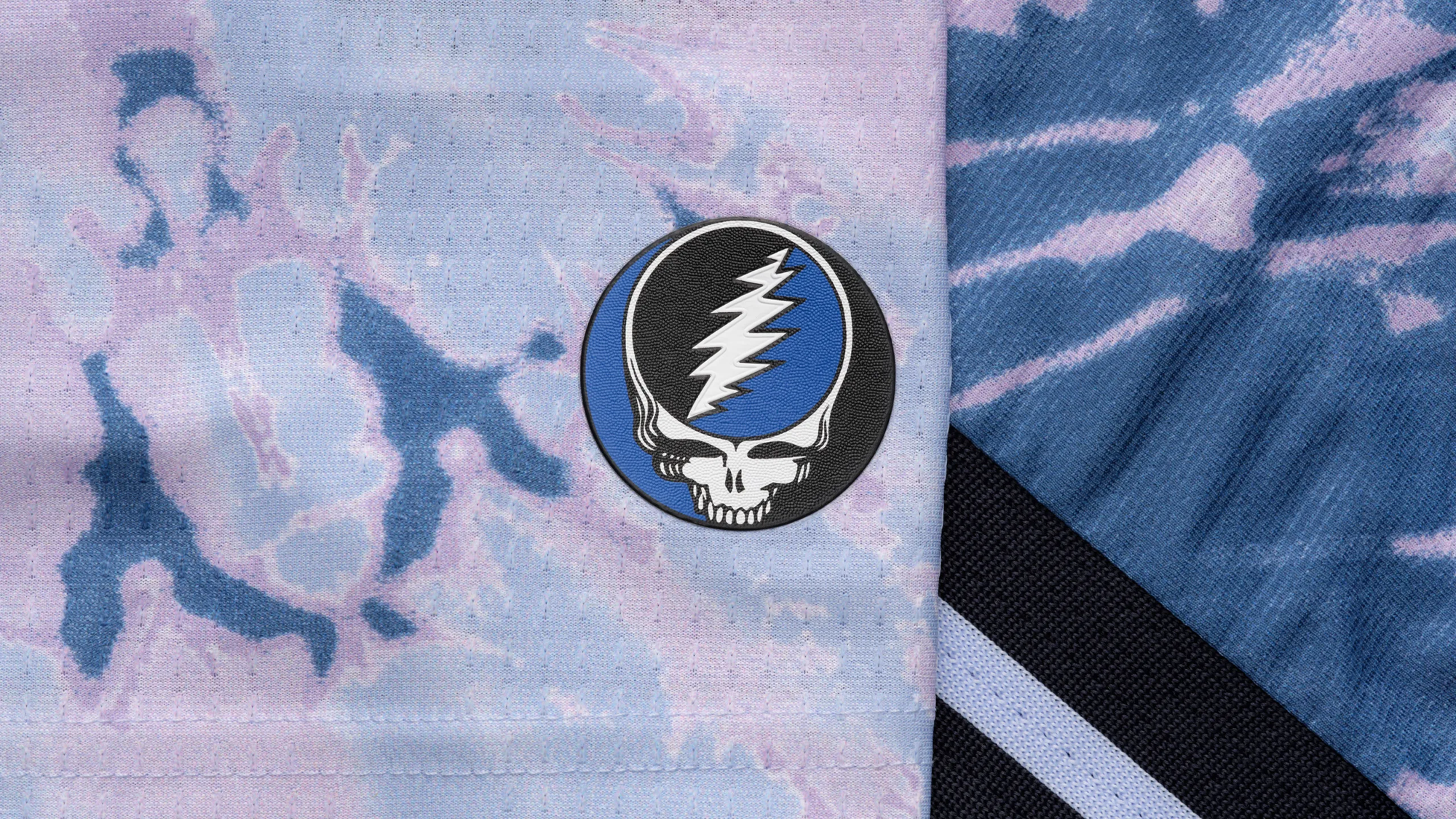
I get that this will speak to a very specific set of folks out there, but man, this one is rough.
San Diego FC
I nearly made a category for "I need to see it in person first" because of this kit.
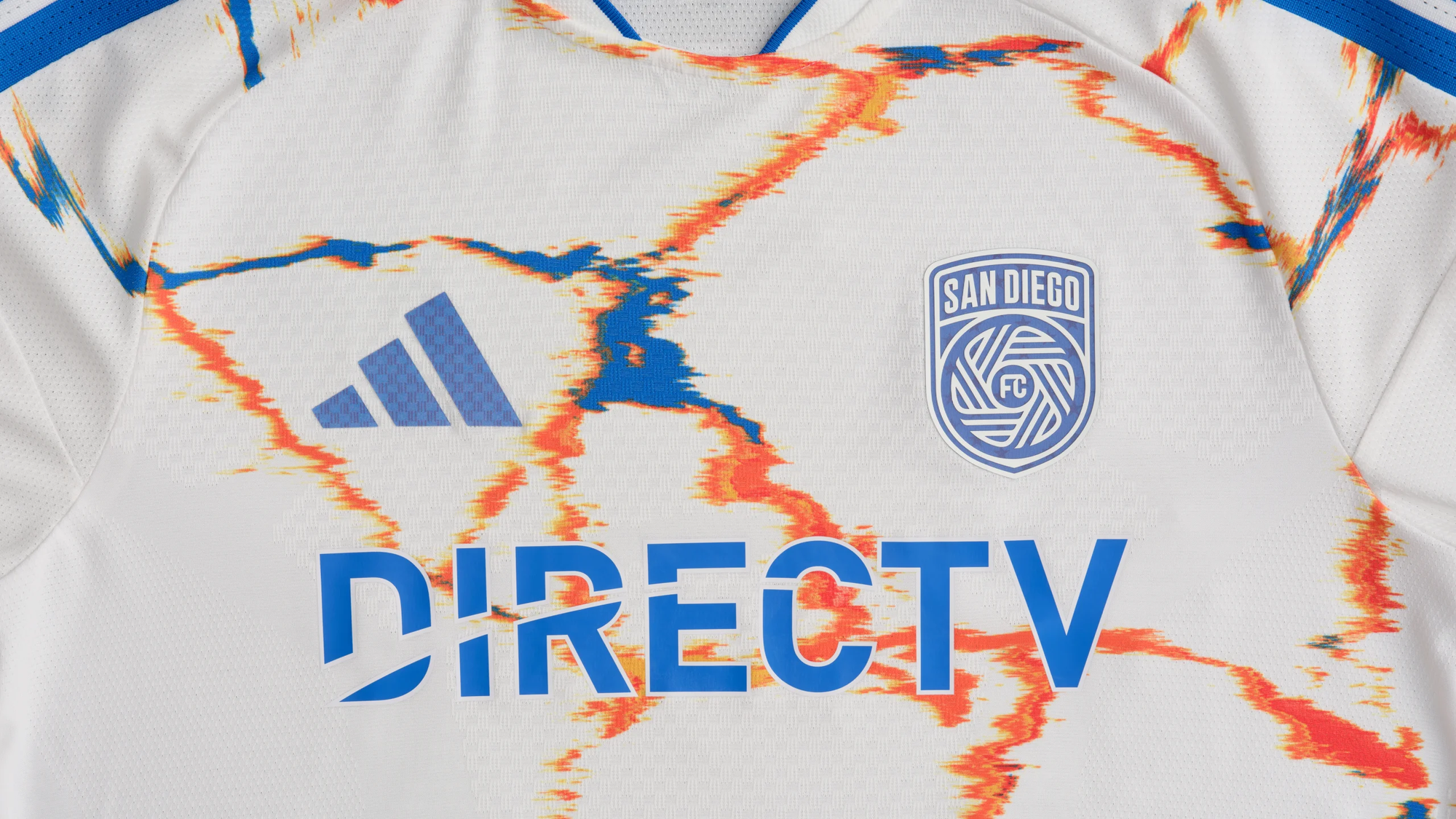
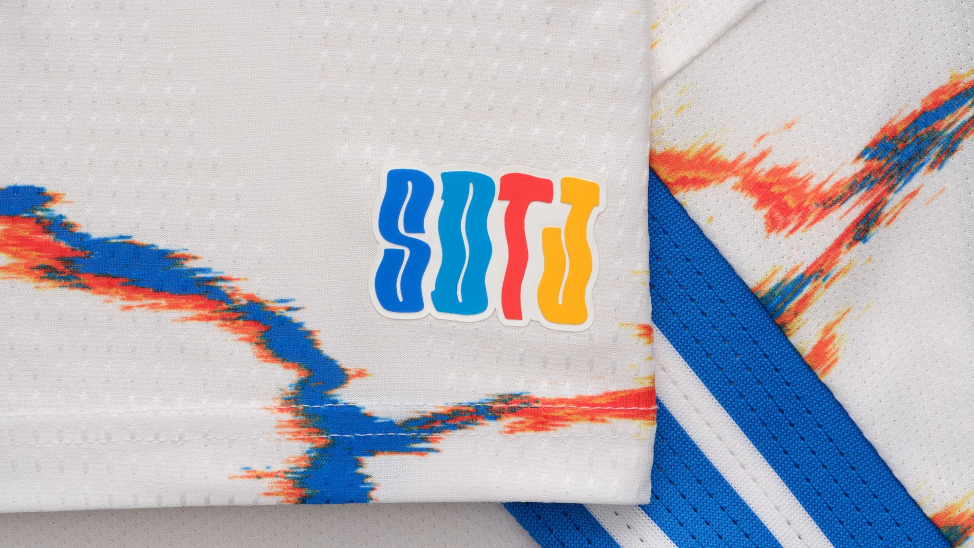
Out of all the newer MLS clubs, I really feel like they are the ones that are phoning it in the most with their kits.
New England Revolution
The Revs will get one thing right in these kits: the nod to the original kits is certainly noticeable and appreciated.
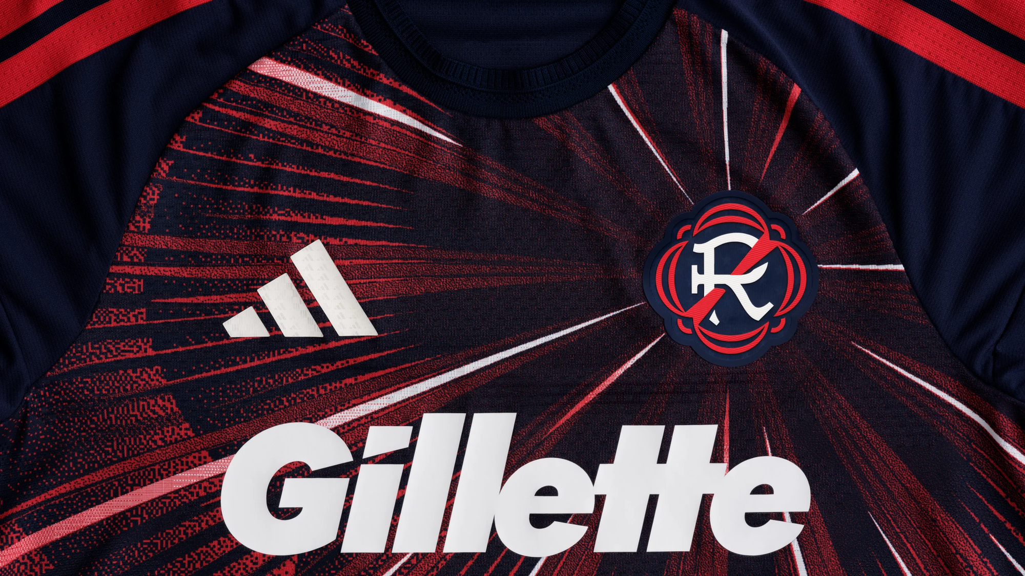
I know I need to see these in person to get a better appreciation of them. Right now, they feel like a bit of a swing and a miss for me.
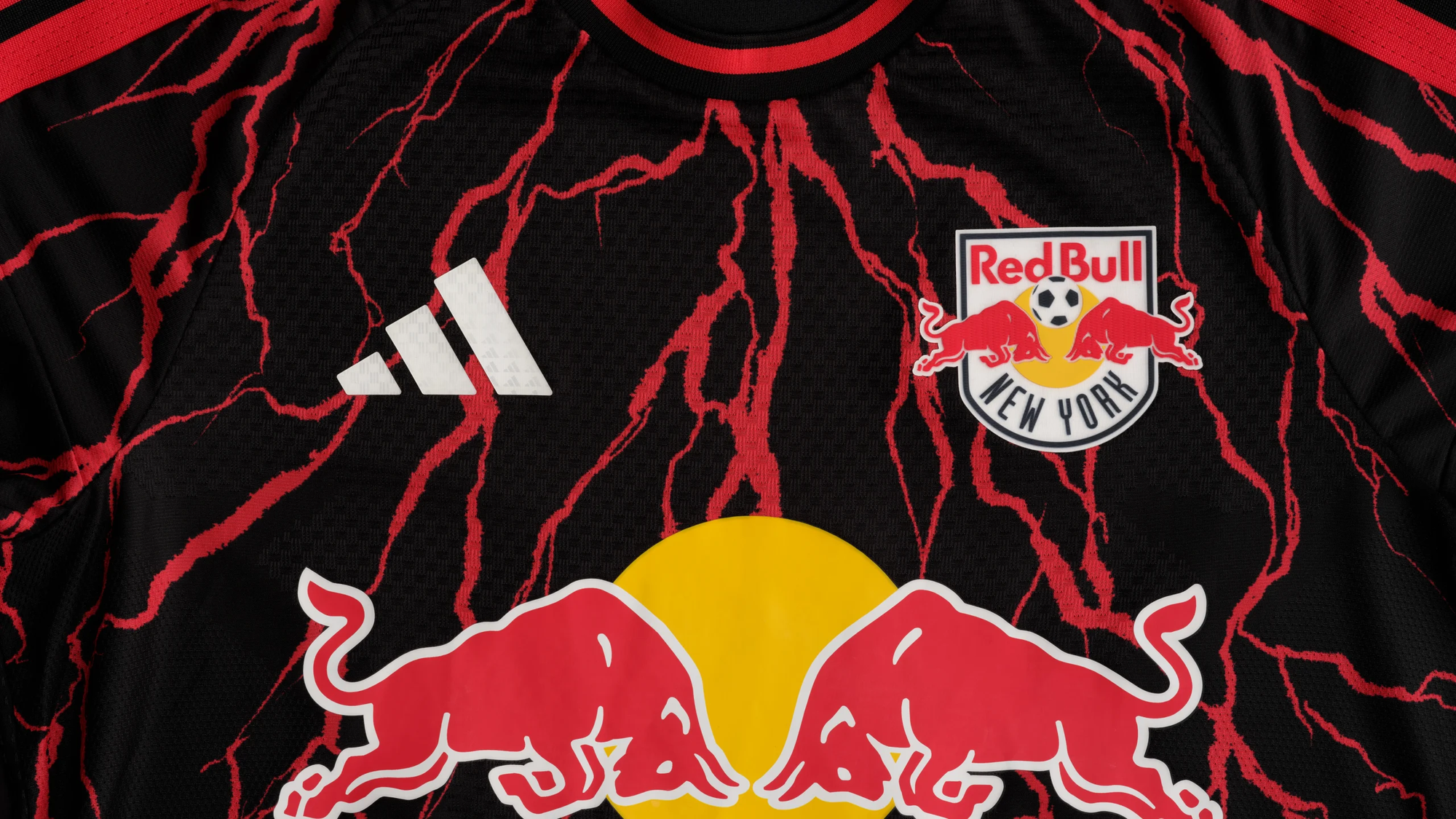
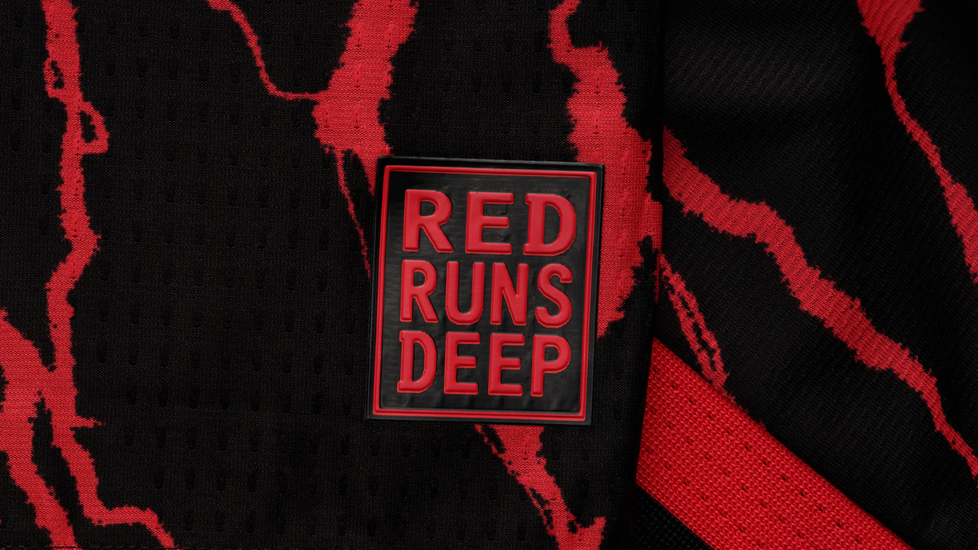
New York Red Bulls
For maybe the third or fourth year in a row, Red Bulls come out with some truly weird kits. I am fully aware that I am not their target demographic.
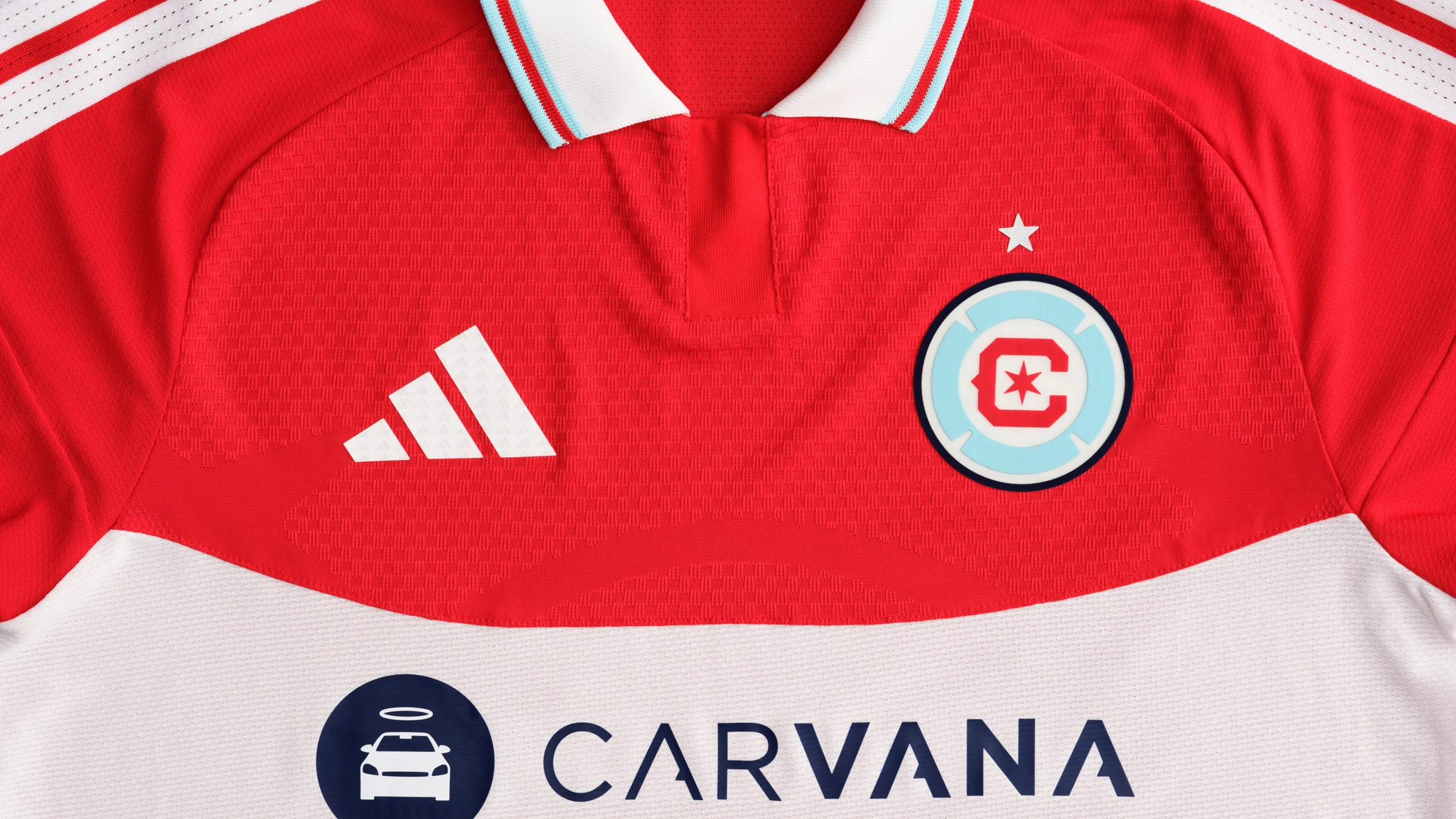
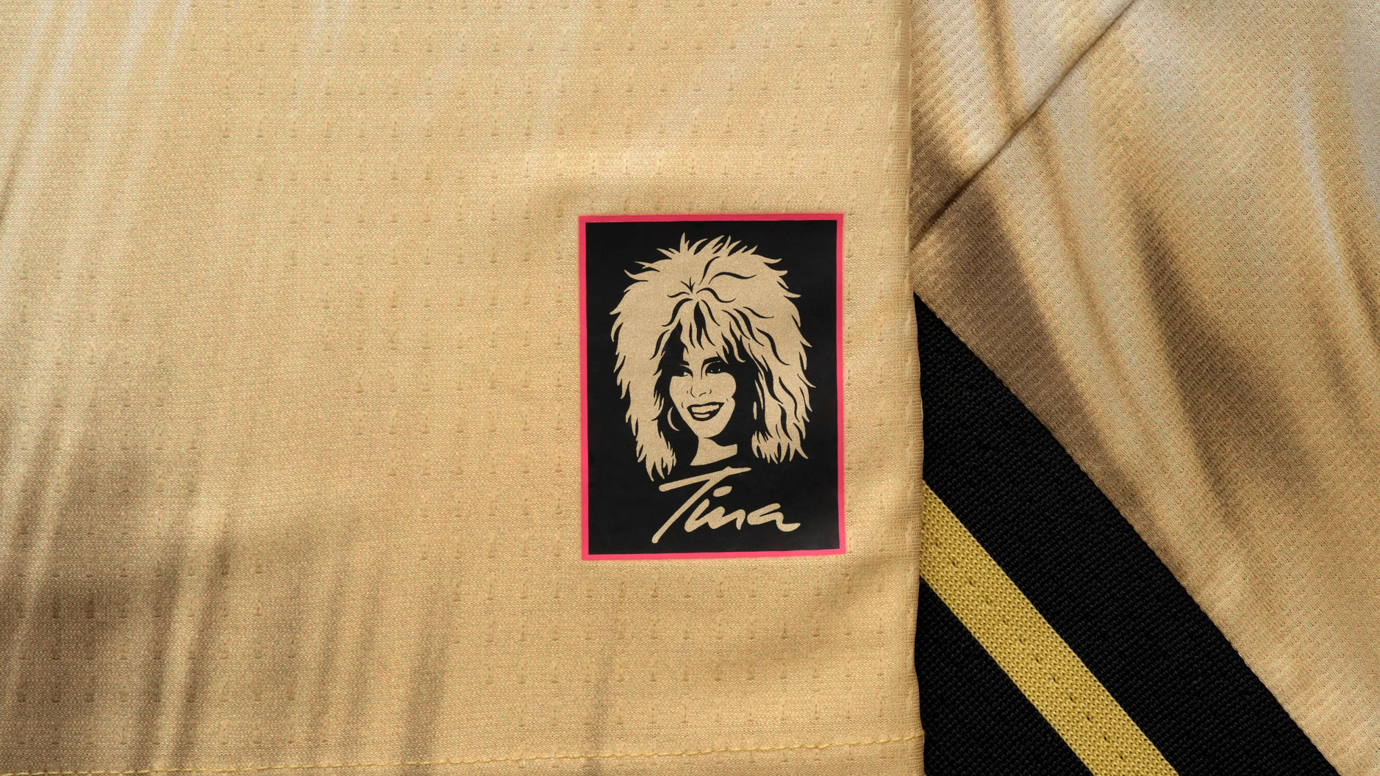
St. Louis CITY SC
So, Tina Turner is a soccer fan? Who knew?
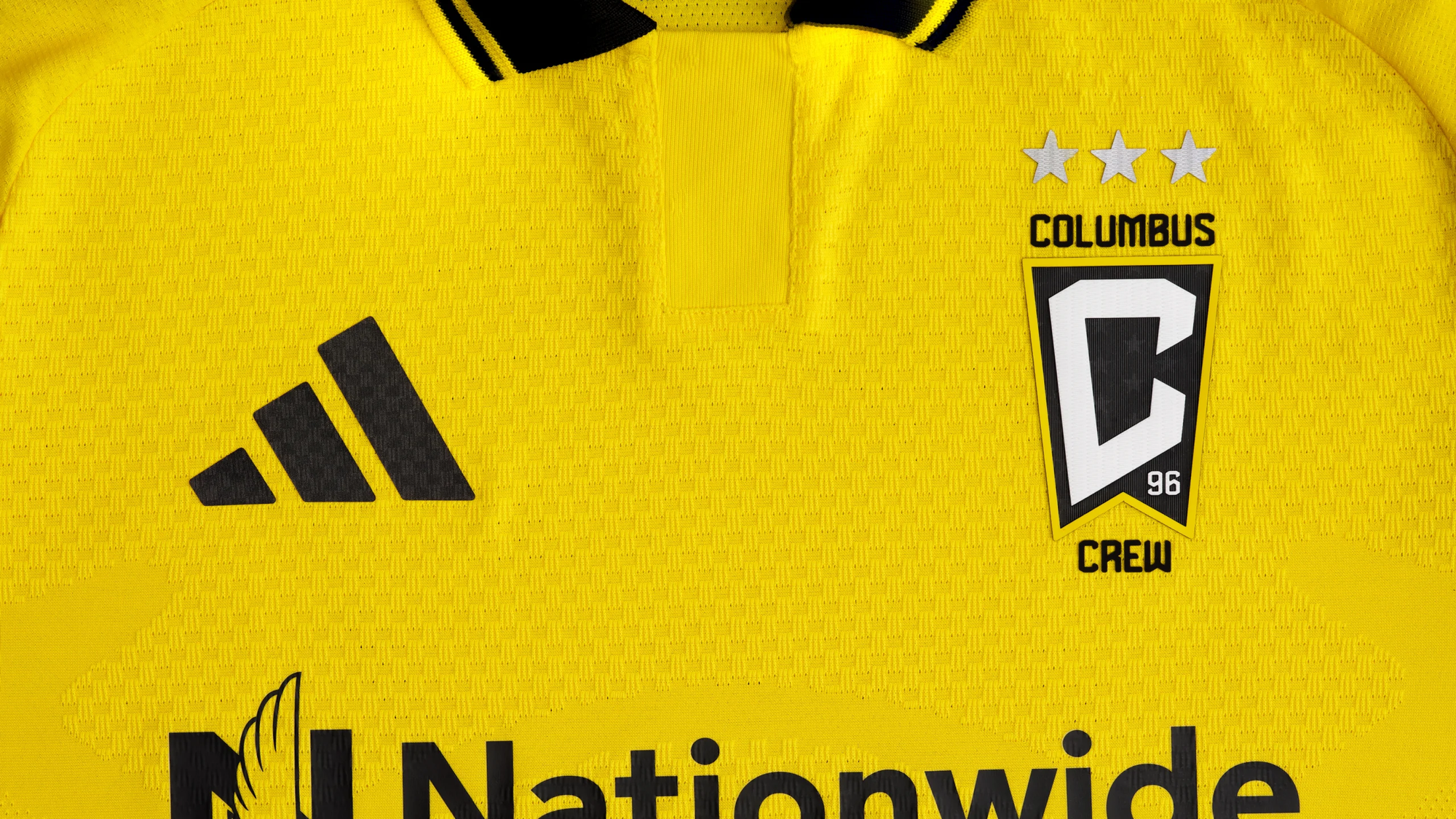
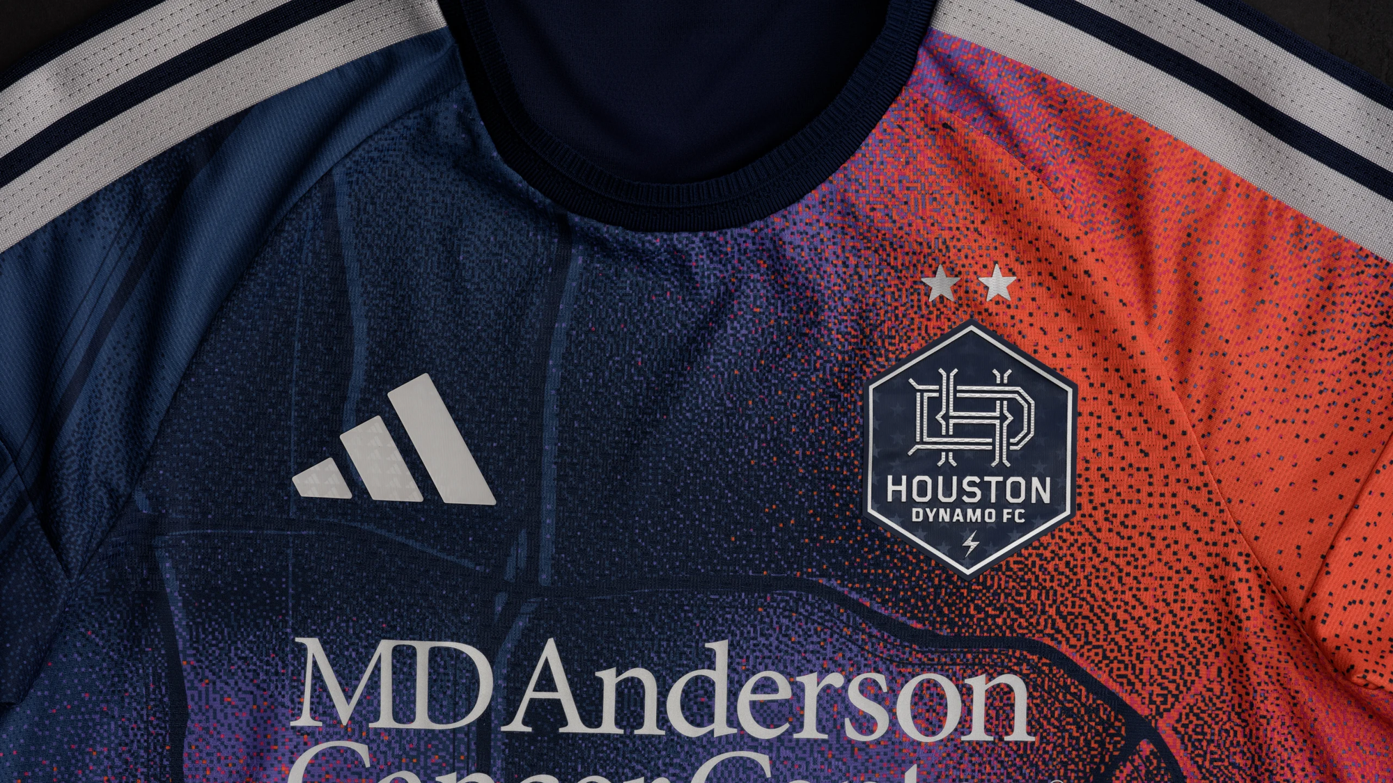
Houston Dynamo
This is one of those kits where I want to just say: pick a single color and stick with it.

The free stuff tells you what happened. A paid subscription tells you why it happened, what it means for FC Dallas, and what’s coming next—before anyone else catches up.


